 |
The data were generated by first choosing whether vertical,
horizontal, both, or neither orientations were active, each with probability ![]() .
Whenever an orientation is active, there is a probability
.
Whenever an orientation is active, there is a probability
![]() for a bar in each row or column to be active. For both orientations,
there are 6 regular bars, one for each row or column, and 3 variance bars
which are 2 rows or columns wide. The intensities (grey level values)
of the bars were drawn from a normalised positive exponential distribution
having the pdf
for a bar in each row or column to be active. For both orientations,
there are 6 regular bars, one for each row or column, and 3 variance bars
which are 2 rows or columns wide. The intensities (grey level values)
of the bars were drawn from a normalised positive exponential distribution
having the pdf ![]() =
=
![]() ,
, ![]() =
= ![]() .
Regular bars are additive, and variance bars produce additive Gaussian
noise having the standard deviation of its intensity.
Finally, Gaussian noise with a standard deviation 0.1 was added to each pixel.
.
Regular bars are additive, and variance bars produce additive Gaussian
noise having the standard deviation of its intensity.
Finally, Gaussian noise with a standard deviation 0.1 was added to each pixel.
The network was built up following the stages shown in Figure 6.
It was initialised with a single layer with 36 nodes corresponding to the 36 dimensional data vector.
The second layer of 30 nodes was created at the sweep 20, and the third layer of 5 nodes at the sweep
100. After creating a layer only its sources were updated for 10
sweeps, and pruning was discouraged for 50 sweeps. New nodes were
added twice, 3 to the second layer and 2 to the third layer,
at sweeps 300 and 400. After that, only the sources were
updated for 5 sweeps, and pruning was again discouraged for 50 sweeps.
The source activations were reset at the sweeps 500, 600 and 700, and only
the sources were updated for the next 40 sweeps.
Dead nodes were removed every 20 sweeps.
The multistage training procedure was designed to avoid suboptimal local
solutions, as discussed in Section 6.2.
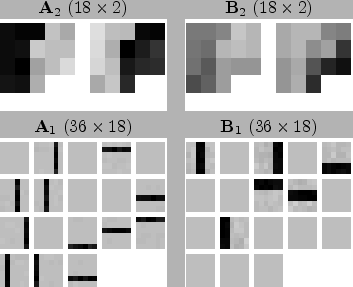
Figure 9 demonstrates that the algorithm
finds a generative model that is quite similar to the generation
process. The two sources on the third layer correspond to the
horizontal and vertical orientations and the 18 sources on the second
layer correspond to the bars. Each element of the weight matrices is
depicted as a pixel with the appropriate grey level value in
Fig. 9. The pixels of
![]() and
and
![]() are ordered similarly as the patches of
are ordered similarly as the patches of
![]() and
and
![]() , that is, vertical bars on the left and horizontal
bars on the right. Regular bars, present in the mixing matrix
, that is, vertical bars on the left and horizontal
bars on the right. Regular bars, present in the mixing matrix
![]() , are reconstructed accurately, but the variance bars in
the mixing matrix
, are reconstructed accurately, but the variance bars in
the mixing matrix
![]() exhibit some noise. The distinction
between horizontal and vertical orientations is clearly visible in the
mixing matrix
exhibit some noise. The distinction
between horizontal and vertical orientations is clearly visible in the
mixing matrix
![]() .
.
 |
|
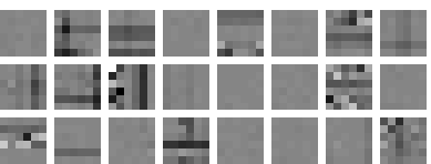
A comparison experiment with a simplified learning procedure was run
to demonstrate the importance of local optima. The creation and
pruning of layers were done as before, but other methods for avoiding
local minima (addition of nodes, discouraging pruning and resetting of
sources) were disabled. The resulting weights can be seen in
Figure 10. This time the learning ends up
in a suboptimal local optimum of the cost function. One of the bars
was not found (second horizontal bar from the bottom), some were
mixed up in a same source (most variance bars share a source with a
regular bar), fourth vertical bar from the left appears twice, and one
of the sources just suppresses variance everywhere. The resulting cost
function (5) is worse by 5292 compared to the main
experiment. The ratio of the model evidences is thus roughly
![]() .
.
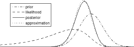
Figure 11 illustrates the formation of the
posterior distribution of a typical single variable. It is the first
component of the variance source
![]() in the comparison
experiment. The prior means here the distribution given its parents
(especially
in the comparison
experiment. The prior means here the distribution given its parents
(especially
![]() and
and
![]() ) and the likelihood means
the potential given its children (the first component of
) and the likelihood means
the potential given its children (the first component of
![]() ). Assuming the posteriors of other variables accurate,
we can plot the true posterior of this variable and compare it to the
Gaussian posterior approximation. Their difference is only 0.007
measured by Kullback-Leibler divergence.
). Assuming the posteriors of other variables accurate,
we can plot the true posterior of this variable and compare it to the
Gaussian posterior approximation. Their difference is only 0.007
measured by Kullback-Leibler divergence.